
A journey intro transforming talabat’s design system into an internal adopted product.

Product Design, UIUX Design, Design System & Motion Design for talabat

talabat is an entity of Delivery Hero, and it’s the number one online food delivery service provider in the Middle East, operating across eight countries: UAE, Kuwait, Qatar, Bahrain, Iraq, Egypt, Jordan and Oman.
talabat connects millions of customers with their favorite restaurants, grocery stores, and everyday essentials. With a commitment to innovation and user experience, talabat continues to redefine convenience, offering seamless solutions that cater to diverse lifestyles and preferences, making it the go-to choice for fast, reliable, and personalized delivery in the region.
talabat's app redesign and rebrand were driven by a need to reduce decision fatigue and empower users with confidence in their choices. We aimed to transform the delivery experience by focusing on usability, effortless interaction, and intuitive access to information.
Recognizing the emotional needs of our users, we sought to foster positive connections and inspire trust. The new app goes beyond food delivery—it remembers your tastes, evolves with your preferences, and offers personalized suggestions for every moment, turning each interaction into a delightful and meaningful experience.


Delivery as a service
Delivering, getting it done
Delivering on promises
Being busy, moving forward
Your independent mind, style
and taste
Double meaning:
1. Without judgement and with authenticity. We’re reliable
and real so so are you.
2. The things we deliver
I joined talabat in 2023 as a Design System Product Designer and I was assigned to work on the REMIX project. Some of my tasks involved:

These are the insights obtained from a series of carefully planned and phased experiments that lasted 12 weeks of rolling out the Remixed talabat experience
A design audit is like a magnifying glass. It takes a hard look at everything your company puts out there, ensuring your brand's image, vibe, and messaging are rock-solid and consistent across the board. You want your audience to know it's you, whether they're scrolling through your website or browsing your ads.
In short, with a design audit, we want an overview of where our design is inconsistent and inefficient.
I conducted a thorough design audit, involving a systematic evaluation of the company's design assets, foundations, components and guidelines, with a focus on identifying redundancies, eliminating duplicates, and organizing elements. The audit served as a valuable tool for identifying areas in need of improvement, streamlining design workflows, and preserving brand cohesion.
The problem: The neutral color palette was being used inconsistently in strokes, dividers, and backgrounds, which causes confusion and reduces visual clarity across the product’s interface.
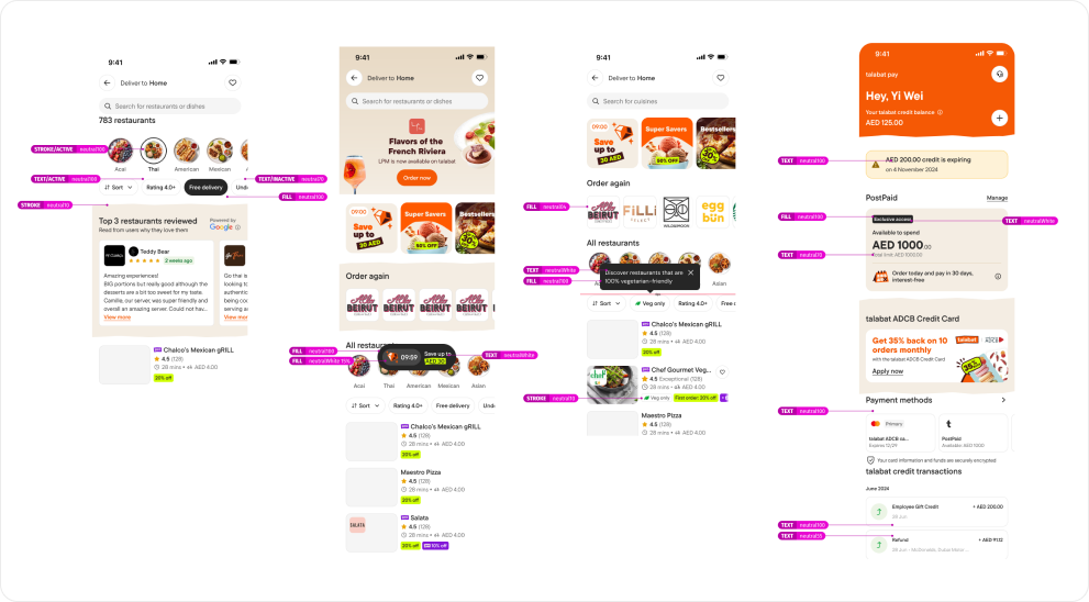
The how: We went through every screen to understand the usage of the neutral colors in the user interface, including all variations and percentages within that range. (Example in the image below)

Audit Findings: The audit showed us the many inconsistencies in how neutral colors were applied to components and specially disabled states. We also gathered feedback from the designers that said that the usage rules were unclear, leading to confusion and overuse.
The solution: Standardizing the use of neutral colors across the app for selected, background, strokes and disabled states to ensure a more consistent application, enhancing usage guidelines and updating design system components.

We started inviting the squads product designers to participate in our process, they would help us curating their use cases, and we would facilitate sessions to create components that really covered all their needs.
As the work load was increasing daily with component requests, change requests, component reviews, bugs, and many other tasks, I took the initiative to establish agile ways of working so the three of us could have a better visibility on each other’s work.
What was done:

When laying the groundwork for a design system, governance emerges as one of its vital pillars. It plays a pivotal role in providing clear expectations and guidelines for the team, ensuring that they can fully harness the potential of the design system.
Our governance process should seamlessly align with the workflows of all verticals within the organization. This harmonious alignment is key to a successful and efficient design system.

Effective communication plays a crucial role in keeping team members informed about updates and the current status of our design elements. To facilitate this, I consistently share updates with the team via Slack.
Furthermore, I host presentations on our Design Chapter meeting, this session serves as a platform to discuss and showcase the latest components under design, fostering a broader understanding of design systems and addressing specific queries.
We also implemented Design System Office Hours, providing support to all teams as needed to discuss design system components and variations, ask questions about the design system, and share their experiences using it. It’s a place where our end users can share their feedback and engage in dialogue.
This proactive communication strategy ensures that all stakeholders are well-informed about any changes and updates in the design system. By maintaining alignment with diverse team expectations, it facilitates a shared understanding and a seamless transition during the implementation of design system updates.

Foundations, often referred to as "atoms," are the fundamental elements of our interfaces. They function as the cornerstone, shaping all aspects of our user interfaces. These foundational elements encompass crucial components like corner radius, breakpoints, colors, grids, shadows, spacing, and typography.
We updated the foundations of the design system using Figma’s variables.


ABCDEFGHI
JKLMNOPQ
RSTUVWXYZ

abcdefghi
jklmnopqr
stuvwxyz

0123
456
789

!@?&#*
<>{}±§^
%$~()


Upon identifying the essential components and patterns needed for our redesigned app, I meticulously prioritized and designed these elements for seamless integration by our engineering team. This preparation paves the way for their widespread adoption across different squads.
I’ve also made improvements to the file structure, enhancing design experience and maintenance by conveniently grouping components into pages, streamlining asset search process.


We also made sure that every foundation, token and component was documented. We used ZeroHeight as our source of truth for documentations, where we also kept change logs, content and flutter documentations.


